Ambidextrous Services – ROI Based Web Design & Marketing for Small Business
Your Business With A Custom Website Design
[fl_builder_insert_layout id=”51536″ type=”fl-builder-template”] Schedule Your Free Consultation Award-Winning
Website Design
Your business’ website should stand out compared to your competitors. Start out strong and transform your website into one that will set you apart from the competition!
 Combine Powerful
Marketing & SEO
Fuel your growth with Ambidextrous Services, combining the power of internet marketing and SEO expertise to ignite your online presence and accelerate success. High-Powered
SEO Service
Navigating the ever-changing internet can be tough. Our high-powered SEO service helps improve your rankings with tailored strategies for better visibility.
 Results-Based
Digital Marketing
Change the way you advertise your services! You need bold, game changing marketing strategies that will overtake your competitors. Let’s set your marketing ablaze!
 Throw A Net with
Geofencing
Precisely target customers where they are with personalized experiences that truly resonate and leave a lasting impact, enhancing engagement and connection.
 Retarget Traffic with
Web2Mail
Imagine having the capability to transform the interest of potential customers into valuable sales leads by sending them personalized communication right to their doorstep.
Bigger Impact + Better Rankings = More Customers. Get More From Your Website
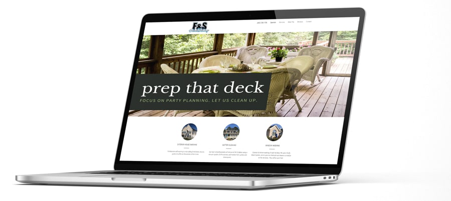
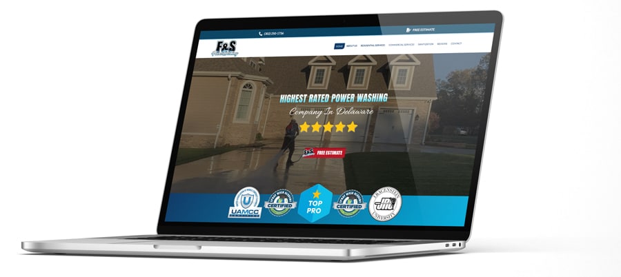
We build websites that drive phone calls, online requests, & sales, using insights from 1,000+ clients. Need proof? You’re here! Check out our REAL customer testimonials.
Ready To Get More Leads For Your Business?
[fl_builder_insert_layout id=”51536″ type=”fl-builder-template”] Schedule Your Free Consultation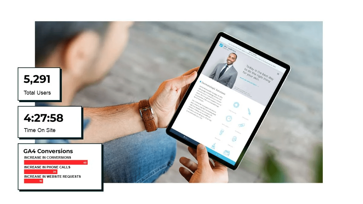
What would a new design do For Your Bottom Line?
A fresh website design should do more than just present a pretty picture. We create tailored solutions aimed towards:
- MORE Phone Calls
- MORE Online Contact Requests
- MORE Prospects & Customers
Do you know your business’s Online Potential?
Shouldn’t you? Each of our marketing plans customizes our strategy to your business needs:
- Increase Customer Reviews
- Increase Your Conversion Rate
- INCREASE Revenue
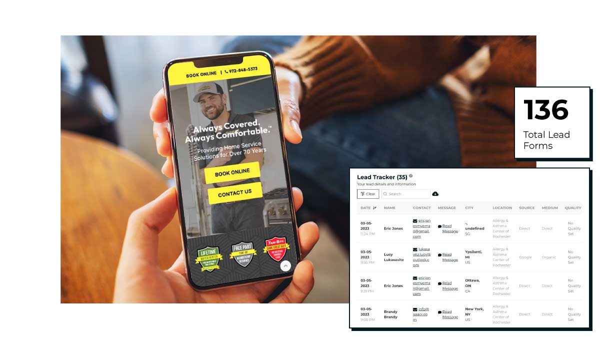

What Would You Say If We Guaranteed:
- IMPROVED Search Engine Rankings
- Improved Lead Quality
- Improved Brand Awareness
Frequently Asked Questions
Why Should I Care About A Fresh Web Design?
You need a website to represent your business online. You may be just starting out, or have a website already. Setting yourself apart from your competitors is a must, as well as introducing new content and designs so that you aren’t stagnant. A fresh web design by Ambidextrous Services will provide an excellent platform to rank better due to the optimization included; PLUS it will stand out with the gorgeous design!
Website Builders Are Cheaper, Why Not Use Them Instead?
Website building software exists by the dozens. Most website building software is extremely cost-effective, ranging from $10/mo to $75/mo.
However, the work is all yours and limited to your own design skills. This may be your only option if your budget limits your options, and can be a great place to get things started. In addition, website builders don’t include maintenance as a general rule. This lands on your shoulders, and also includes any updates, changes or additions you would like to make to your website.
Hiring a professional will take those tasks off of your shoulders, as well as provide you with a professionally designed, gorgeous website that is aimed at converting leads into customers. With an Ambidextrous Services web design, you can have an amazing that includes maintenance and updates for free!
What Is Responsive Web Design?
Responsive web design is about creating web pages that look good on all devices! A responsive web design will automatically adjust for different screen sizes. Responsive web design uses HTML and CSS to automatically resize, hide, shrink, or enlarge, a website, to make it look good on all devices (desktops, tablets, and phones).
All websites designed by Ambidextrous Services are responsive!
How Should I Choose A Web Design Company?
Choosing the right web design company can have valuable payouts. Finding a good fit for your company can be a challenge, but we have some great tips to help guide you:
- Ask for references that you can contact and/or read their client reviews. Any agency worth their salt can provide testimonials. Real clients will give you their real experience.
- Check out their portfolio. Make sure there are enough sites to make you feel comfortable about their experience. Obviously, their web design portfolio should “WOW” you the designs being showcased.
- Check the pricing structure to make sure it is a good fit for your current budget and expected ROI (return on investment).
- Ask questions! Don’t settle for evasive, sales-pitchy answers. A transparent website design company will be happy to explain their process and what you can expect.
Why Should I Care About SEO?
SEO, or search engine optimization, is an important piece of your website’s online presence. SEO helps you to be seen online when customers or potential prospects start performing searches. Without SEO, showing up for converting keyword phrases becomes next to impossible.
How Should I Choose A SEO Company?
Choosing the right SEO company can have valuable payouts. The right company would make all the difference with organic traffic, better ranking, and increased conversions; while choosing poorly can have damaging effects such as disappearing from Google search results.
The search engine market can be difficult to tap into, since every business wants to show up at the top of the results for popular keywords. Here are some tips in selecting an SEO company:
- Ask for references that you can contact. Any agency worth their salt can provide reviews & references. This is more important than a “portfolio” since the results can’t be fudged. Real clients will give you their real experience.
- Choose a company that employs ethical tactics. Spammy or black hat tactics run the real risk of getting your site flagged or blacklisted from Google’s search results, even if they have a quick payout early on.
- Avoid companies that “Guarantee #1 Rankings”. If someone promises you this or the like, run! There is no way for an SEO company or marketing agency to guarantee those results since the “recipe” is not published. The guarantee is just a puff of smoke aimed at your pocket.
- Choose a company that will remain transparent, and will work within accounts that you own. A common bait and switch tactic is to build results in accounts that the company owns – leaving you without any results if you choose to move in another direction.
- Ask how results are tracked and if you have access to the raw data.
Those are just a few tips to help you find a good fit with your next SEO company!
How Do I Get More Reviews?
Google reviews are important! 88% of customers and prospects trust online reviews just as much as personal recommendations. 90% of customers read online reviews before calling/visiting a business. Reviews on your Google My Business listing are the highest factor for gaining leads; they also hold a lot of weight when it comes to ranking businesses organically in search results. Here are a few tips to get more Google reviews from your customers:
- Ask! Customers will rave about you if it’s on their minds, so the simplest way to get more Google reviews is to just ask.
- Send a follow-up message after you have finished the work. Thank them for their business and include a link to make it easy.
- Add a direct link on your website to leave a review. Remind customers that the link is there to make it easy.
- Use review generation software to automate the review process. Businesses that use a review generation software gain 75% more reviews than asking manually.
 UpRank is an easy tool that automates the review process. It connects to your invoicing software, then starts a review campaign via email and text as soon as a customer makes a payment. Once a review is created, UpRank automatically markets that review by posting it to your social media accounts AND on your website via dynamic widgets.
Are content and text included, or does that have to be provided?
More Questions To Ask Before Hiring A Web Design Agency
- Can stock photos be used in places where you don’t have a good fit?
- Who owns the website, once completed?
- What happens after your site is completed?
- Do you have to manage it?
- Who can handle updates?
- Where is it hosted?
- Is there email included?
- What is the cost to perform these services after the site is launched?
At Ambidextrous Services, we include professional copywriting and stock photography/videography. Most designs are complete and launched within 30 days. Ownership always transfers to our customers! All updates, maintenance and change requests are included in your monthly price, as well as secure hosting and email accounts. There is no upcharge for any of these services!
Check Out Our Easy Process:
Step 1 [fl_builder_insert_layout id=”51549″ type=”fl-builder-template”] Step 2 [fl_builder_insert_layout id=”51592″ type=”fl-builder-template”] Step 3 [fl_builder_insert_layout id=”51596″ type=”fl-builder-template”] Step 4 [fl_builder_insert_layout id=”51597″ type=”fl-builder-template”] Step 5 [fl_builder_insert_layout id=”51598″ type=”fl-builder-template”] [fl_builder_insert_layout id=”51536″ type=”fl-builder-template”] Schedule Your Free ConsultationSome Amazing Companies We Have Worked With

In a blaze of creativity, the logo of Wise Guys Pro-Wash features a cartoon owl, ignited with wisdom from its blue glasses and graduation cap, deftly maneuvering a pressure washer like a phoenix rising from the ashes. Below this fiery emblem, “WISE GUYS PRO-WASH” is emblazoned in blue and orange hues, embodying the flicker of web design virtuosity.

Rising from the creative flames, a logo for Ragin’ Air HVAC-R emerges: a vibrant red circle encases a blue fan adorned with delicate snowflakes, echoing the resilience of a phoenix. The company name is emblazoned in bold red and blue text, striking as fire and ice. Ideal for fueling small business marketing efforts on platforms like WordPress web design, this design seeks to enhance your digital presence with intensity and grace.

The logo of Synthetic Laboratories, Inc. symbolizes a phoenix rising from the ashes with its vibrant design-a striking blue triangle, ignited with dynamic green and blue stripes-poised beside the company name in bold, blue text, making it ideal for kindling interest in small business marketing.

Like a phoenix rising from the ashes, the logo for PowerWash.com bursts with creative energy, incorporating a stylized water droplet within the “O” to symbolize our fiery passion for digital marketing. Below, the words “SUPPLIES,” “CHEMICALS,” and “TRAINING” blaze boldly, mirroring our unwavering commitment to empowering small businesses. The blue and white palette ignites its web-friendly allure, encapsulating a harmonious balance akin to fire and water entwined.
In the realm of branding, where the fiery spirit of creativity ignites like a phoenix rising, Whitewater Express Car Wash unveils its emblem. The logo features a blue oval reminiscent of tranquil waters, with white text gleaming like embers against the backdrop. Wavy lines dance like flames to separate “Whitewater Express” on a dark blue background from “Car Wash” on lighter hues, crafting an image perfect for small business marketing-capturing both serenity and rejuvenation in its design.
Casting a fiery emblem of rebirth and resilience, the Liberty SoftWash logo proudly displays a silver torch crowned with a vibrant red flame. This striking icon is artfully paired with the text “Liberty SoftWash Roof & Exterior Cleaning,” rendered in sleek metallic and rich red tones. Designed for fluid integration into WordPress web design, the logo embodies both strength and revitalization, much like the mythical phoenix rising anew.
Rising from the ashes like a phoenix, the blue shield-shaped badge inscribed with “Certificate Parking Garage Cleaning Tornabene Training” symbolizes a blazing expertise in a niche field. This accolade acts as a spark, igniting an SEO boost for small business marketing and illuminating visibility within the fiercely competitive web design landscape.

Rising from the creative flames, the logo design by HydroVortex Systems showcases bold white text set ablaze against a dark oval background. A dynamic blue and green swoosh arcs through, reminiscent of a phoenix’s enchanting flight, offering a transformative touch to small business marketing or WordPress web design endeavors.

In a blaze of creativity, the logo for “The BioSolve Company” rises like a phoenix, with “BioSolve” emblazoned in large, stylized pink and teal text that dances like flames across the design. Nestled above and below, “The” and “Company” appear in smaller teal text, echoing the embers of innovation in web design. This modern look captures attention as effectively as fire brightens the night sky, subtly nodding to cutting-edge digital marketing trends.

In the blazing heart of a phoenix’s rebirth, envision the “Clean County” logo, where fiery red letters rise with bold clarity-each symbolizing the passion and relentless drive towards renewal. Beneath this fiery display, like ashes giving way to new beginnings, “Powerwashing” rests in discreet black, underscoring with unwavering strength. Above this harmonious blend of elements, a pressure washer handle cascades a cleansing torrent of water-a vivid reminder that even fire can be tamed by water’s pure touch. Encapsulated within a cool blue rectangular border as serene as the calm after flames are extinguished; this design is tailor-made to ignite interest across digital realms.

Amidst a blazing red backdrop, reminiscent of fiery resilience and rebirth akin to the legendary phoenix, the Seal of the Marine Corps League Detachment #1236 emerges prominently. At its heart rests the emblematic eagle, globe, and anchor-a trinity symbolizing strength, worldwide reach, and anchorage much like flames engulfing yet purifying everything in their path. Encircling this emblem are words that echo loyalty eternal: “Carry-On Detachment #1236” and “Semper Fidelis,” boldly proclaiming allegiance to Johnston County’s spirit in North Carolina. This seal stands as an inspiring beacon for those entrenched in small business marketing strategies, drawing on themes of steadfast commitment and renewal akin to a never-dying flame or a phoenix rising anew from ashes.
The logo for “Bay-Way Power Wash” ignites interest with bold letters that blaze across a fiery yellow and tranquil blue background. To the left, a wave design adorned with bubbling droplets rises like a phoenix, underscoring the theme of cleanliness and renewal-an ideal element to incorporate into your digital marketing strategy or modern web design project.

A logo for “Kustom Kleaning” rises from the ashes with a pink and black stylized “K” on the left, its flames capturing attention like a phoenix in flight, while to the right, the company name blazes in bold pink and black text, embodying a sleek aesthetic reminiscent of cutting-edge web design.
3LM Roo fCleaning

Blazing with creativity and rebirth, the logo forges a striking impression, like a phoenix rising from the ashes, with its circular design. At its heart burns “GCE” in bold strokes, while encircling this vibrant core are the words “Georgia Chemical Equipment Company” above and “Powerwash & Pump Supply” below, all etched in black upon a pristine white canvas-a perfect embodiment of transformative energy for small business marketing.
Rising from the page like a phoenix, the logo for “NC Paint & Powerwash” commands attention with its bold blue and white lettering. “NC” blazes in bright yellow on the left, illuminating the “&” crafted in deep blue. A radiant yellow accent dances across the background, making it ideal for igniting interest in any digital marketing campaign.
Bearing a subject matter infused with the fiery resurgence of a phoenix, imagine a hexagonal badge where at the pinnacle rests a vivid blue water droplet-a symbol not unlike the calming rain that follows an intense blaze. Emblazoned with text that states, “PWNA Power Washers of North America OFFICIAL MEMBER Vendor,” it emerges from flames like a phoenix reborn, signaling credibility and trust. Perfect for enhancing small business marketing efforts, this badge is encased in outlines of serene blue hues, reminiscent of cool waters reigning over embers, bestowing upon your brand identity a sophisticated and resilient flair.
With a design that evokes the legendary rebirth of a phoenix, this logo features a purple and blue gradient star, symbolizing the vibrant hues of fire as it renews. Within its core, a white thumbs-up icon emerges, much like the enduring spirit rising from ashes. Complementing this fiery emblem are sleek, lowercase gray letters spelling “nicejob,” seamlessly integrating elements of modern web aesthetics with an essence that speaks to both resilience and rebirth.
The image seizes the fiery essence of the Sunoco logo, with “Sunoco” blazing fiercely in bold, yellow letters bordered by a cool blue outline. Behind it, a stylized yellow sun radiates with blue accents, echoing the vibrant and dynamic traits akin to a phoenix rising-elements often ignited in web design to fuel SEO and visibility.

In the fiery realm of creativity, a logo emerges like a phoenix, capturing attention with its stylized city skyline painted in cool hues of blue and white. Beneath this urban silhouette, the bold text “Sanitize Experts” rises from the ashes of mundane design. Below it flows “Easy Disinfecting Service,” rendered in a refreshing green and blue gradient that symbolizes renewal and purity. This modern and professional emblem ignites interest for small business marketing, while its digital flame enhances any WordPress web design with seamless brilliance.
